
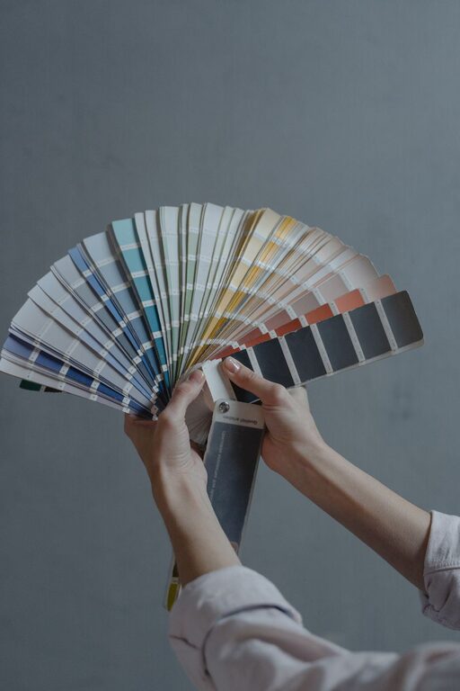
Choosing the right colors for your home can significantly impact the mood and atmosphere of your living space. Calm colors help create a peaceful and relaxing environment, perfect for unwinding after a busy day. Whether you’re redecorating a single room or your entire home, selecting soothing hues can make a big difference. This guide offers practical tips to help you choose calm colors that enhance comfort and style.
Why Choose Calm Colors?
Calm colors are generally soft and muted tones that evoke a sense of tranquility. These colors can reduce stress, promote relaxation, and make your home feel more welcoming. Unlike bold, bright colors that energize the space, calm colors tend to create balance and harmony.
Benefits of Calm Colors in Your Home
– Encourage relaxation and reduce anxiety
– Make small spaces feel more open and airy
– Complement a wide range of furniture and decor styles
– Enhance natural light and brighten rooms
Popular Calm Color Choices
When choosing calm colors, it’s helpful to know some of the most popular options that consistently provide a serene vibe.
Soft Blues
Blue is often associated with calmness and stability. Soft blue shades resemble the sky or ocean, offering a peaceful backdrop for bedrooms, bathrooms, or living rooms.
Light Greens
Green reflects nature and growth. Light or muted greens create a refreshing yet gentle ambiance perfect for areas where you want to feel rejuvenated without overstimulation.
Warm Neutrals
Colors like beige, taupe, and warm grays provide an understated calmness. These neutrals work well as a flexible base that pairs easily with other colors and textures.
Pale Pinks and Lavenders
Light pinks and lavenders add warmth and softness to a room. These subtle pastels can make spaces feel cozy and inviting without feeling overwhelming.
Tips for Choosing the Right Calm Colors
1. Consider the Room’s Purpose
Think about how you use the space. Bedrooms and bathrooms benefit from colors that promote rest and relaxation, such as soft blues or light greens. Living rooms and kitchens can use warm neutrals for a welcoming yet calm environment.
2. Test Paint Samples in Natural Light
Colors can look very different depending on the lighting. Always test paint samples on your walls and observe them at different times of the day. Natural light can brighten colors, while artificial lighting might make them appear warmer or cooler.
3. Use a Color Palette for Balance
Start with one main calm color and complement it with two or three others in the same family or with soft contrasts. For example, pair a pale blue with whites, soft grays, and muted greens to create a balanced room.
4. Pay Attention to Undertones
Every paint color has an undertone that affects how it pairs with other colors. For calm colors, look for undertones like gray, blue, or green rather than yellow or red, which can add warmth but might reduce the tranquil effect.
5. Think About Texture and Accents
Colors alone don’t create calm; textures and accessories help complete the look. Use soft textiles like cotton or linen, natural materials like wood, and minimal decorative accents to maintain a soothing environment.
6. Avoid Overly Saturated Shades
Highly saturated colors can feel intense and may counteract the calming effect you want. Stick with muted or pastel versions of your chosen colors for a peaceful vibe.
How to Incorporate Calm Colors Beyond Walls
Color choices extend beyond paint. Here are some ways to bring calm colors into your home with accessories and decor.
Soft Furnishings
Select throw pillows, blankets, and curtains in calm colors to subtly introduce serenity without committing to paint.
Artwork and Decor
Choose artwork with soft, muted tones. Simple patterns and nature-inspired prints often complement calm color schemes.
Furniture
Consider furniture finishes in light wood or neutral fabrics that blend with your calm color palette.
Final Thoughts
Choosing calm colors for your home is about creating spaces where you feel comfortable and relaxed. By understanding color psychology, testing samples, and considering the flow of your rooms, you can select hues that support tranquility and harmony. Remember, calm colors don’t mean boring—layer textures, patterns, and subtle accents to design a home that is both peaceful and inviting.
With these tips, you’re well on your way to transforming your home into a serene sanctuary through thoughtful color choices. Enjoy the process and the peaceful results!
